ROLE: Lead UX Designer & Researcher
DURATION: June 2021 – July 2021
Project Vision
The web application Edu is an online platform for students to learn. Providing a platform that is easily accessible provides a revolutionary change in educational life.
Challenges
- Centralized location for learning material
- Aligning structural elements to reduce heavy text-based layouts
- One-stop shop for easier learning
- Accreditation from certified sources
Competitive analysis
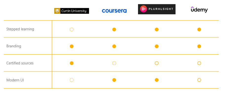
To ensure Edu provides the best functionality and elaborates on advantages that other platforms don’t give, we need to take into consideration our competitor, both directly and indirectly. As such, only one of the four online learning platforms are certified with articles and learning materials from their industrial partners. Ensuring that validity of information is available to learn is crucial when it comes to taking exams and getting graded on assessments towards a certification or a degree.
By taking advantage of the features that each platform offers allows you to cater for what is doing well as well as consider the intricacies that will make our own platform stand out amongst the rest.
Meet the users
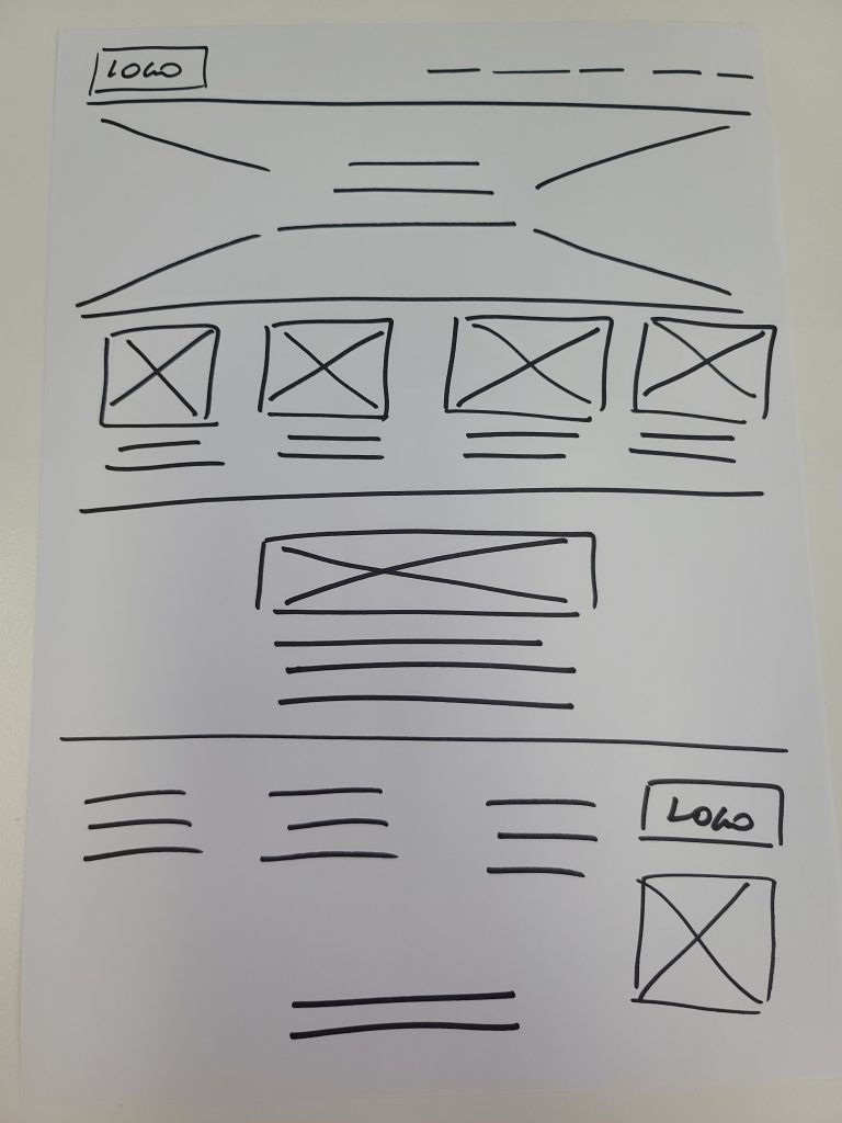
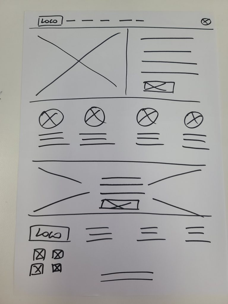
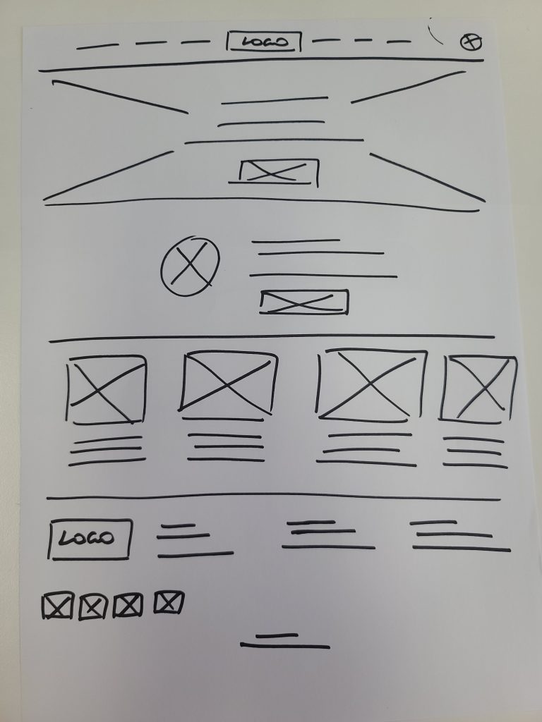
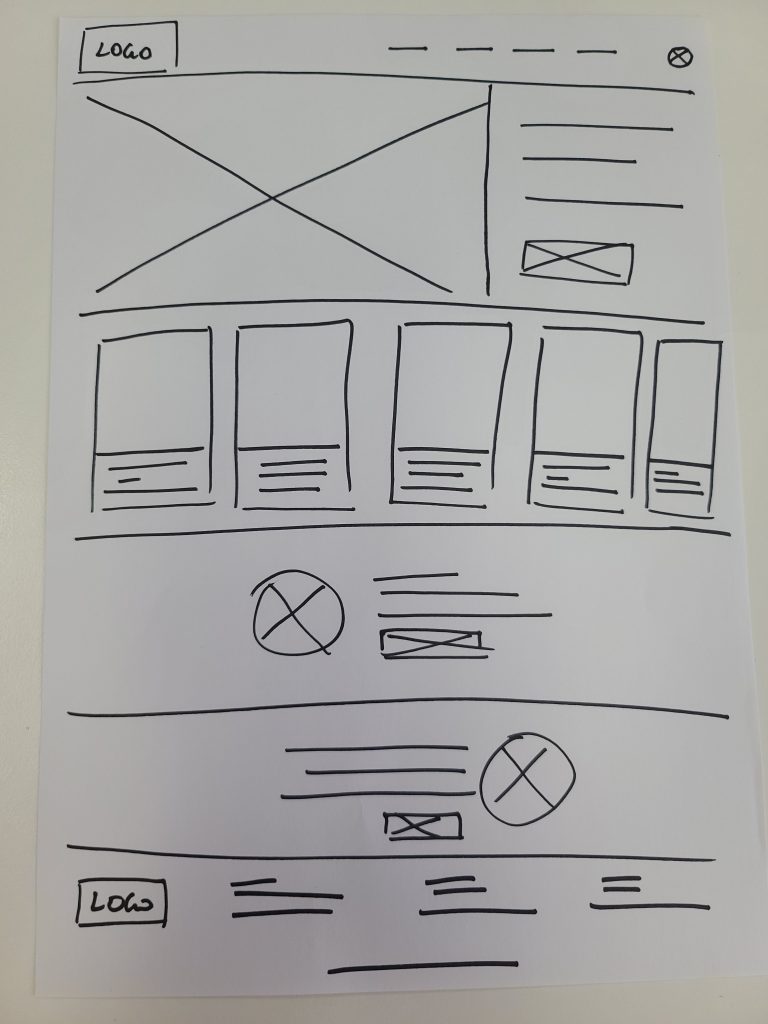
P&P Wireframes
Moving towards high fidelity wireframes and prototypes, the core of the app needs to be designed to ensure the user flow and the experience is right for the user.
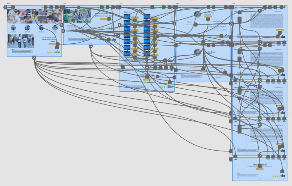
Wireflow
Construction the connections between all displays determines how a user travels through the experience and completes the journey through the app.
CHALLENGE 1
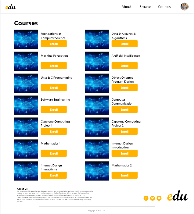
Centralized location for learning material
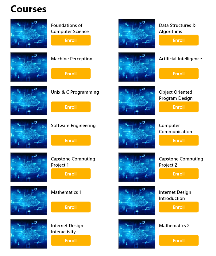
Learners want a consolidated place to find all the learning material they need to ensure they are learning from one source of content.
CHALLENGE 2
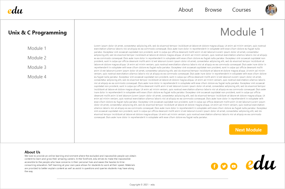
Aligning structural elements to reduce heavy text-based layouts
Structural designs allows for the user to seek information in the places they look for on the page.
CHALLENGE 3
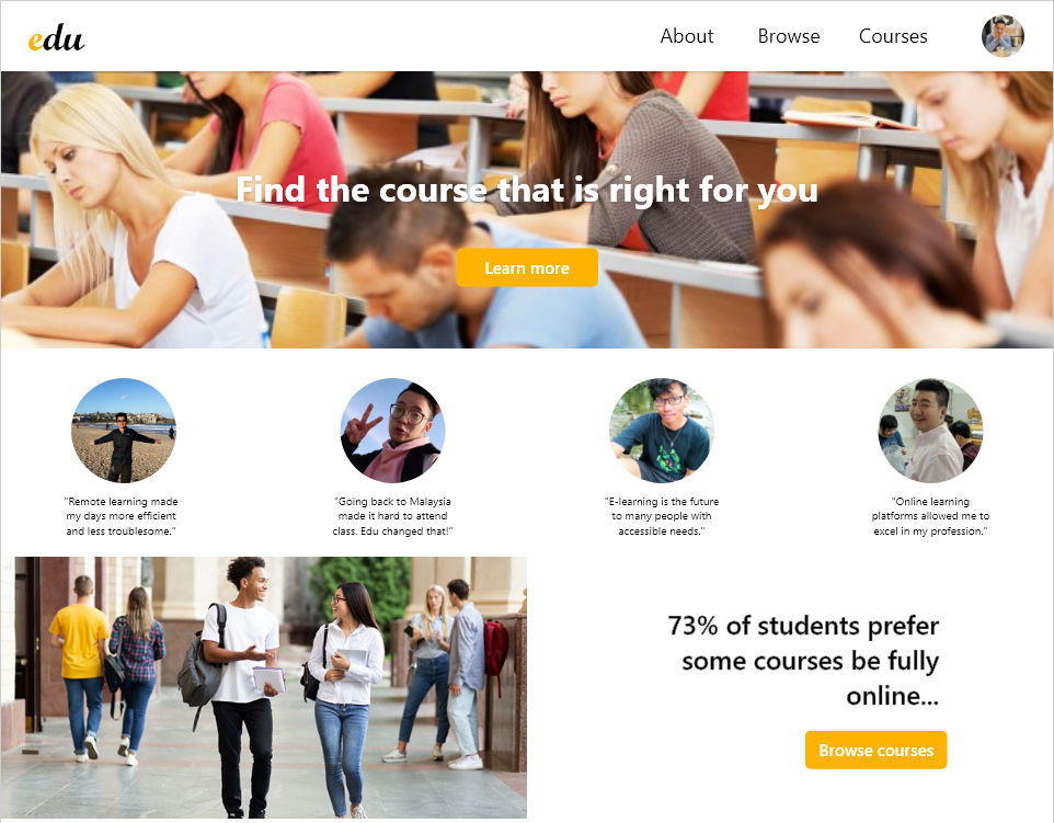
One-stop shop for easier learning
A platform that holds all the information needed for a course of learning allows the user not to find multiple entities for different explanations and can trust one source of information.
CHALLENGE 4
Accreditation from certified sources
For users to get the best out of their learning, the sources of information are to be from the institutes distributing the accreditations.
Style Guide
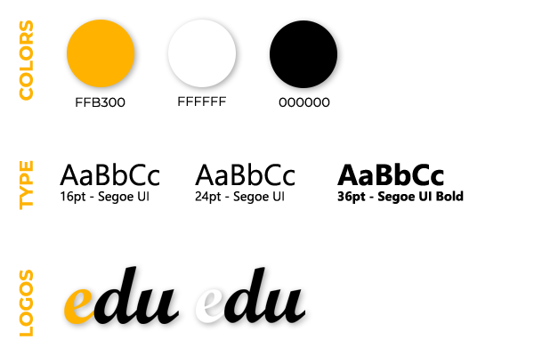
Using the magenta pink instills slight aggressiveness to show pride and dominance in the games that users achieve well in as well as not being too harsh to show other players they are capable to learn and grow. Black and white are standard colors to distribute harmony and open space in areas of the application.
Takeaways
As a person who is always learning, having access to remote learning material is crucial during my busy days. Balancing full-time work and learning new content is really beneficial for me to fit in the small gaps I have during the day. It gives me a sense of relief to work on a project like this that will impact my life and the life of people who are learning just like I am.
I thoroughly enjoyed this project as it gave me into insights on how to be a student but from a designer point of view. Having different eyes on a platform allows me to design well for the person using it as well as the person who develops it.
